
Welcome back to Consider It Mapped, where we mark our sixth installment of mapping school performance grades in North Carolina. As I sit down to reflect on the latest mapping, I am struck by how little has changed since we started investigating the data in 2014-15. We’ll start with a bit of context and then dive into the latest analysis.
Getting up to speed on grade calculations
For those who are new to this series, here is a primer on how the school performance grades are calculated:
- The N.C. Department of Public Instruction (DPI) reports school performance grades annually. Reporting of A-F letter grades began in 2013-14.
- Academic achievement, including measures of student progress like test scores (ex. End-of-Grade, End-of-Course, and ACT test results), graduation rates, and measures of work readiness, makes up 80% of a school’s grade. School growth, measured by the extent to which students met or exceeded the state’s performance expectations for that school for that year, makes up the other 20%. The formula is set by legislation passed by the N.C. General Assembly.
- DPI reports grades on a 15-point scale. Original legislation was written with the intent to establish a 10-point grading scale, but in 2019, lawmakers made the 15-point grading scale permanent with Session Law 2019-154 (Section I).
Here you can find more information about school performance grades, including the executive summary, the annual testing report, the background brief on the accountability framework, and the communication webinar.
![]() Sign up for the EdWeekly, a Friday roundup of the most important education news of the week.
Sign up for the EdWeekly, a Friday roundup of the most important education news of the week.
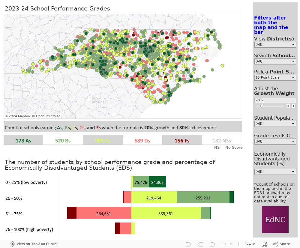
How to use the maps
The map displays grades for the 2023-24 school year. Using the slider, users can adjust the growth weight (set at the current 20%) and point scale (set at the current 15-point) and search for their district or school. Filters beneath the point scale and growth weight selectors allow users to look at subsets of the data, specifically student population, grade levels offered, and percentage of economically disadvantaged students (EDS). All filters in the sidebar control the map and accompanying bar chart below.
The bar chart shows the number of students by the letter grade their school earned. The bar chart is further subdivided by percentage of EDS that attend the school. A percentage of EDS between 0-25% indicates lower levels of student poverty in a school, while a percentage of 75-100% indicates high levels of poverty.
Click here if viewing on a tablet and here if viewing on mobile.
The analysis
The state is now 10 years into assessing schools with A-F letter grades. The infrastructure first rolled out in 2013-14 and has persisted over the last decade with the exception of a two-year period during the pandemic in which schools were not evaluated. While the latest assessment from DPI indicates that schools statewide are making strides in improving math scores, proficiency for English Language Learners, and graduation rates, there’s also a lot that hasn’t changed.
We still see a higher concentration of economically disadvantaged students in schools with D and F performance grades
The first screen cap shows our assessment from 2017-2018 and the second from 2023-24.
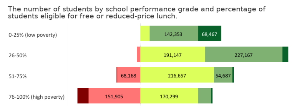
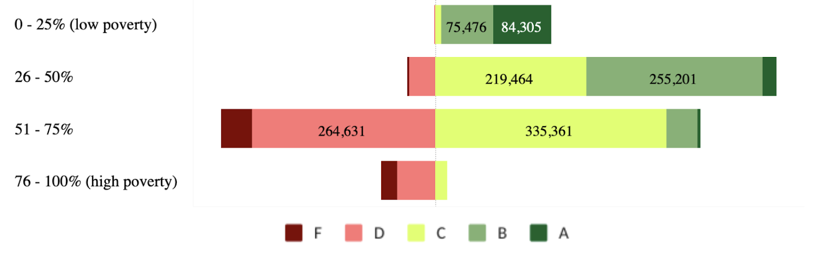
While higher percentages of disadvantaged students are still concentrated in schools with Ds and Fs, the latest assessment shows that there are fewer students in the category with the highest percentage of disadvantage. Additional investigation could be made into the root cause of this shift.
We haven’t seen many major shifts in overall grade distributions statewide in the last decade
Overall, the following chart shows a positive trend of increasing As and Bs and decreasing Ds and Fs through the 2018-2019 school year. One thing to note is that the formulation of the grades was changed slightly in the 2016-17 school year so comparisons pre- and post- should be made with caution, but we wanted to include grades at each historical time point in the chart below to show that overall trends and proportions have not changed significantly over time.
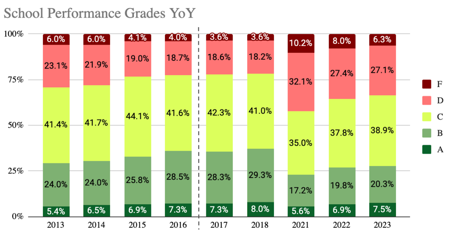
When comparing the trends leading up to the 2018-19 school year to the years following the pandemic (schools were not assessed in 2019-20 and 2020-2021), we see a similar trend emerging between the 2021-22 through 2023-24 school years. Perhaps given enough time to rebound, overall grade distributions could return to levels seen in 2018-19.
We are still discussing how the grades can more holistically measure school performance
Over the years, many leaders in the education field have called out the fact that their schools are more than just their achievement scores. An article published by EdNC in early September indicates that DPI officials and lawmakers seem to be closer than ever to changing the guidelines for measuring school performance grades to provide a more encompassing view of student success.
So, if we aren’t making seismic shifts in outcomes for students based on the overall school grades and the overall grades are not telling the whole story of how schools are tracking towards learning and development goals, what would provide education officials with the information they need to truly push for the best outcomes for their students? Based on the data and testimony from education leaders, two potential avenues for investigation could include further assessment into individual score components and greater accountability outside of school and district officials.
The DPI press release that was provided along with the 2023-24 school performance grades indicates that schools are making progress in key areas. A better understanding of scores cut by grade level, percent EDS, student population, and more could provide insights into schools and student groups that would benefit most from additional resourcing to improve scores in specific areas. With the release of the 2023-24 school performance grades, EdNC started this work by creating visualizations of the data broken out by subgroup for each of the scoring components.
In addition, one could argue that expectations for improving school grades cannot rest solely with educators and DPI officials. While they are part of the equation, many in these positions don’t have the authority to make decisions about funding and support without approvals from others, like representatives in the state legislature. What if politicians and community leaders were also held accountable for improving outcomes in their district in a tangible way? Would this result in increased attention to education outcomes in our districts, and increased political will to support our public schools?
What do you think? Share your thoughts with us on Facebook or X.
Consider It Mapped over the years
Here is the first Consider It Mapped for 2013-14. Our questions early on included:
- Are school scores related in any way to differences in the affluence of their communities, and, if so, should these differences be factored into the overall grades?
- Are there other ways to measure growth beyond using high-stakes testing progress from year to year?
- What other factors should be included in the overall school grades?
Here is our Consider It Mapped for 2014-15.
Here is our Consider It Mapped for 2015-16. This map allows you to compare the first three years of letter grades.
Here is our Consider It Mapped for 2017-18. This year, the way that DPI calculated grades changed. Comparisons to earlier years may provide prospective but don’t assume a one-to-one relationship regarding increases or decreases in school grades.
Here is our Consider It Mapped for 2018-19.
Here is our Consider It Mapped for 2021-22.
Behind the Story
As you examine the multiple data sources/articles shared above, you may notice that the dashboard does not match grade counts and distributions in other analyses. This is because the dashboard is based on calculations that require both an achievement score and a growth score. If a school is missing one or the other, they will receive a “NS” because the calculation must have both elements to function. This accounts for discrepancies between overall school performance grade counts in the report and the visuals in the dashboard.

Recommended reading